Branding · Design Thinking · Copywriting
Healthful
Creative Direction & Copywriting · Anecdote
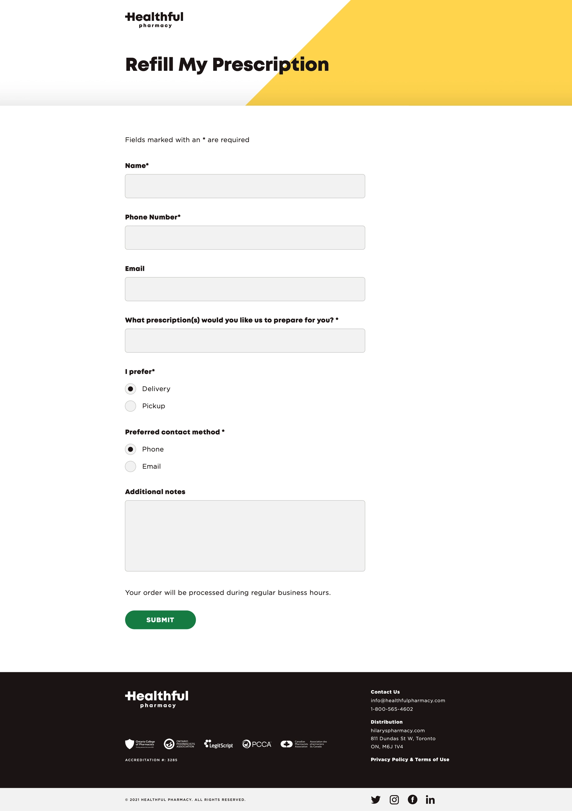
Healthful Pharmacy connects community pharmacists with patients — virtual doctor visits, fast prescription delivery, and care that feels personal again. My role: build the entire brand from the ground up. Visual identity, voice, brand book, product design, and website creative direction — working directly with the CEO and key stakeholders from the first mood board to the final launch.
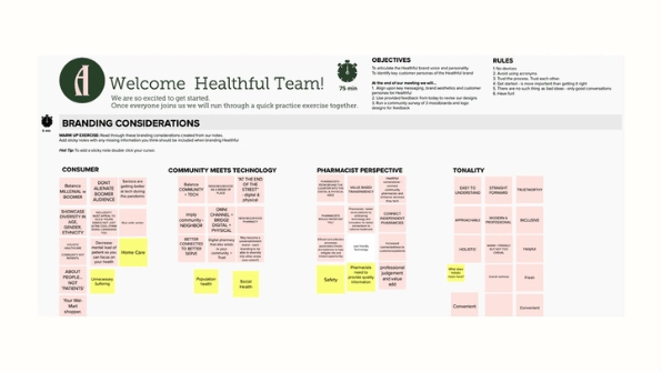
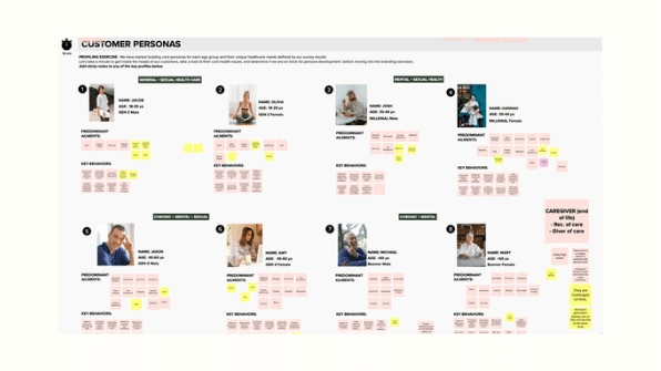
Rather than hand down a brand direction, I led two collaborative design-thinking workshops with the CEO and key stakeholders — using Mural to work through visual identity, voice, and customer personas together in real time. We started with 3 distinct brand directions, combined our favorite elements from each into one, then tested taglines and concepts with our paid ad partner before locking the final direction.
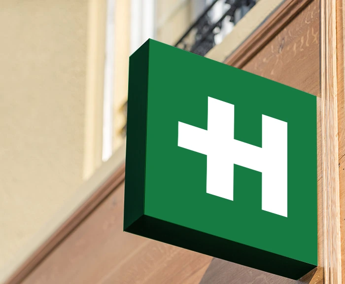
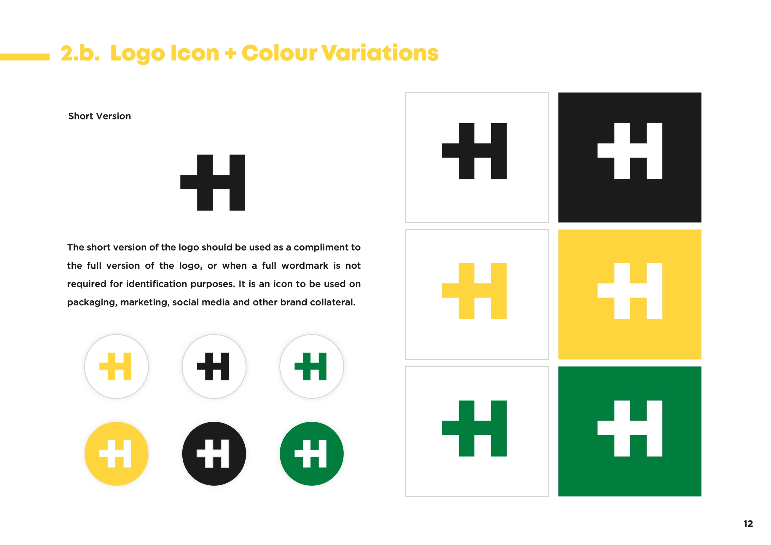
A unique symbol — the first-aid cross fused with the letter H — paired with a warm, modern palette that feels friendly without losing credibility. Trademark clearance was a real constraint here, not an afterthought: I worked directly with a trademark lawyer so every mark, colorway, and application cleared international requirements before it shipped. They still use the logo today, though the palette has since changed.
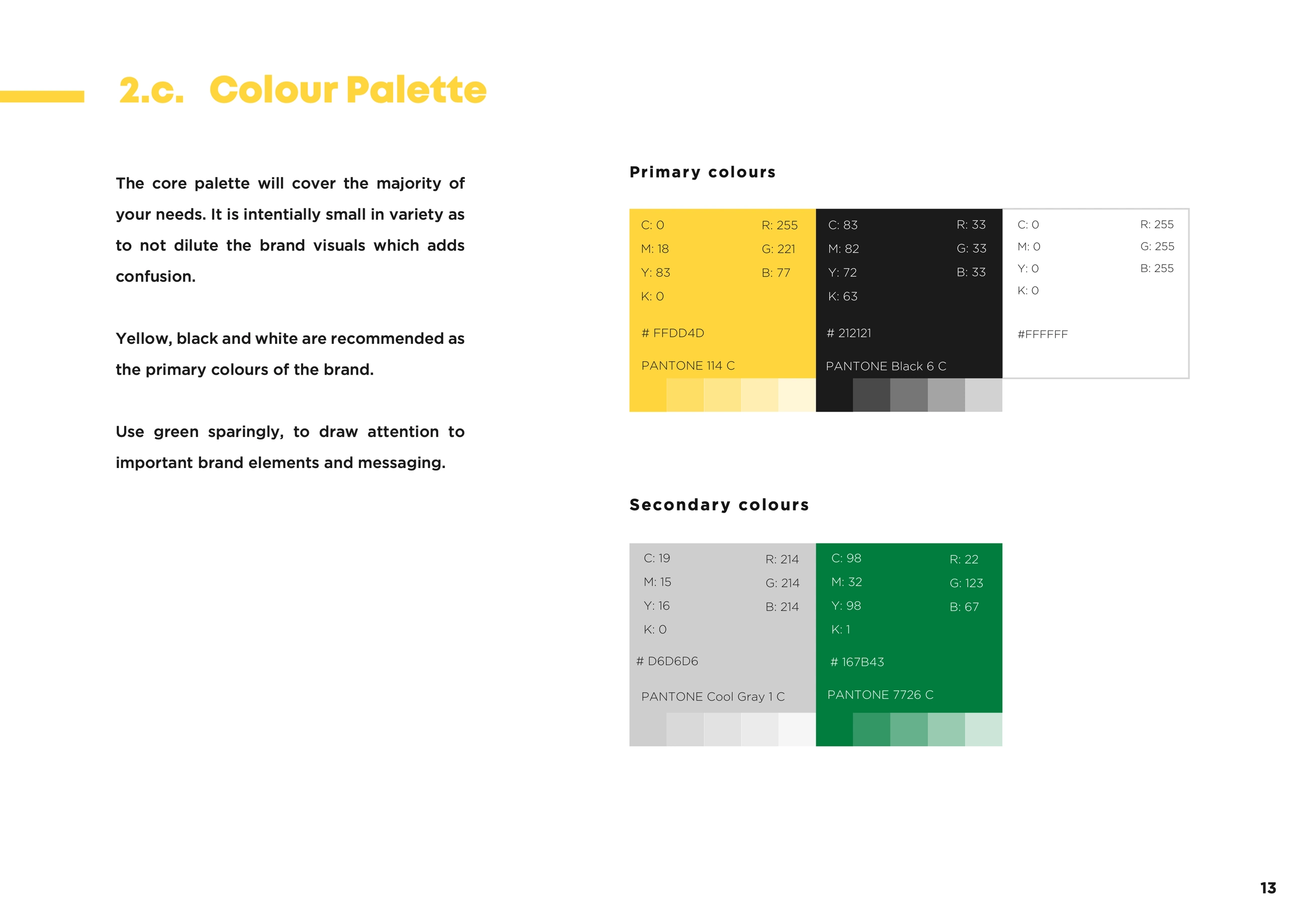
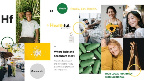
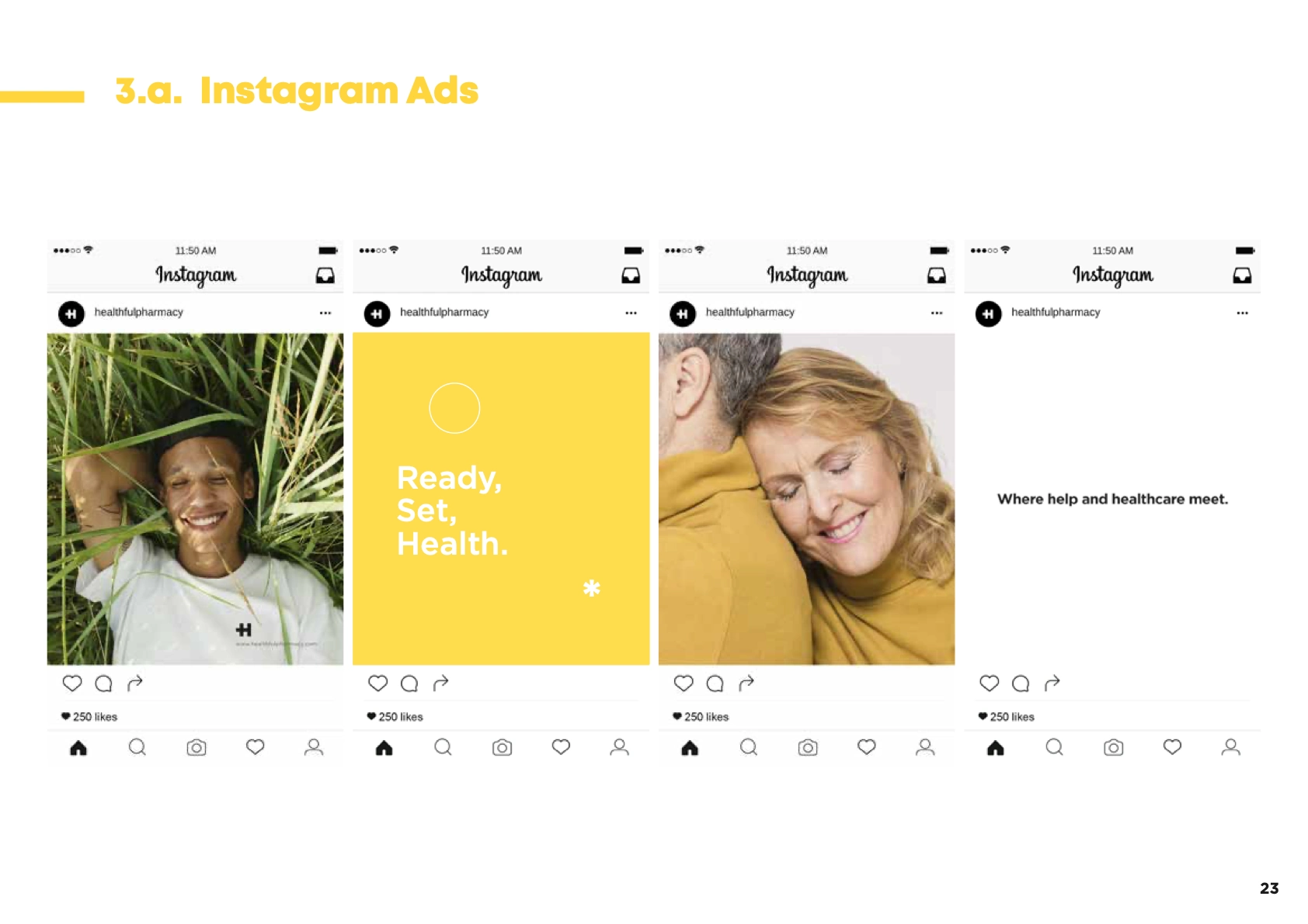
Warm and vivid colors. Green, white, and yellow tones. Close-up frames, overhead shots, clean aesthetics. Joy, nature, free spirit, good vibes. Inclusivity of age, gender, and ethnicity. That's the photography direction, in the exact language I gave the team.
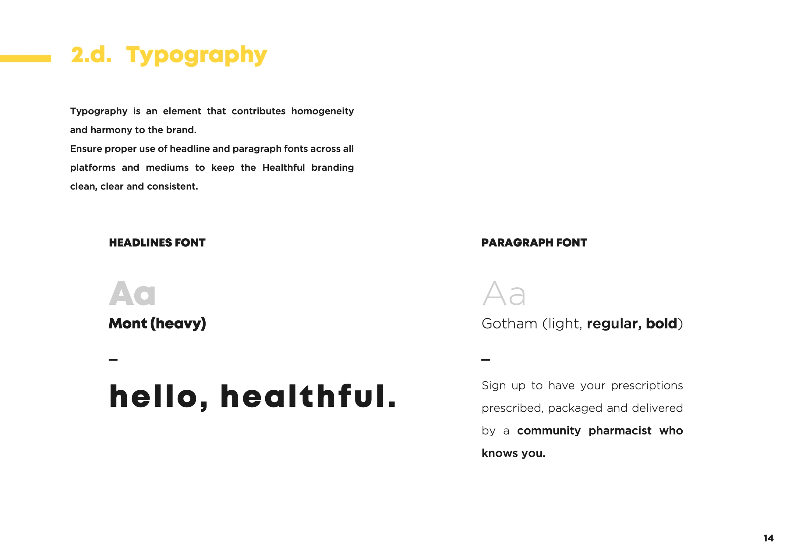
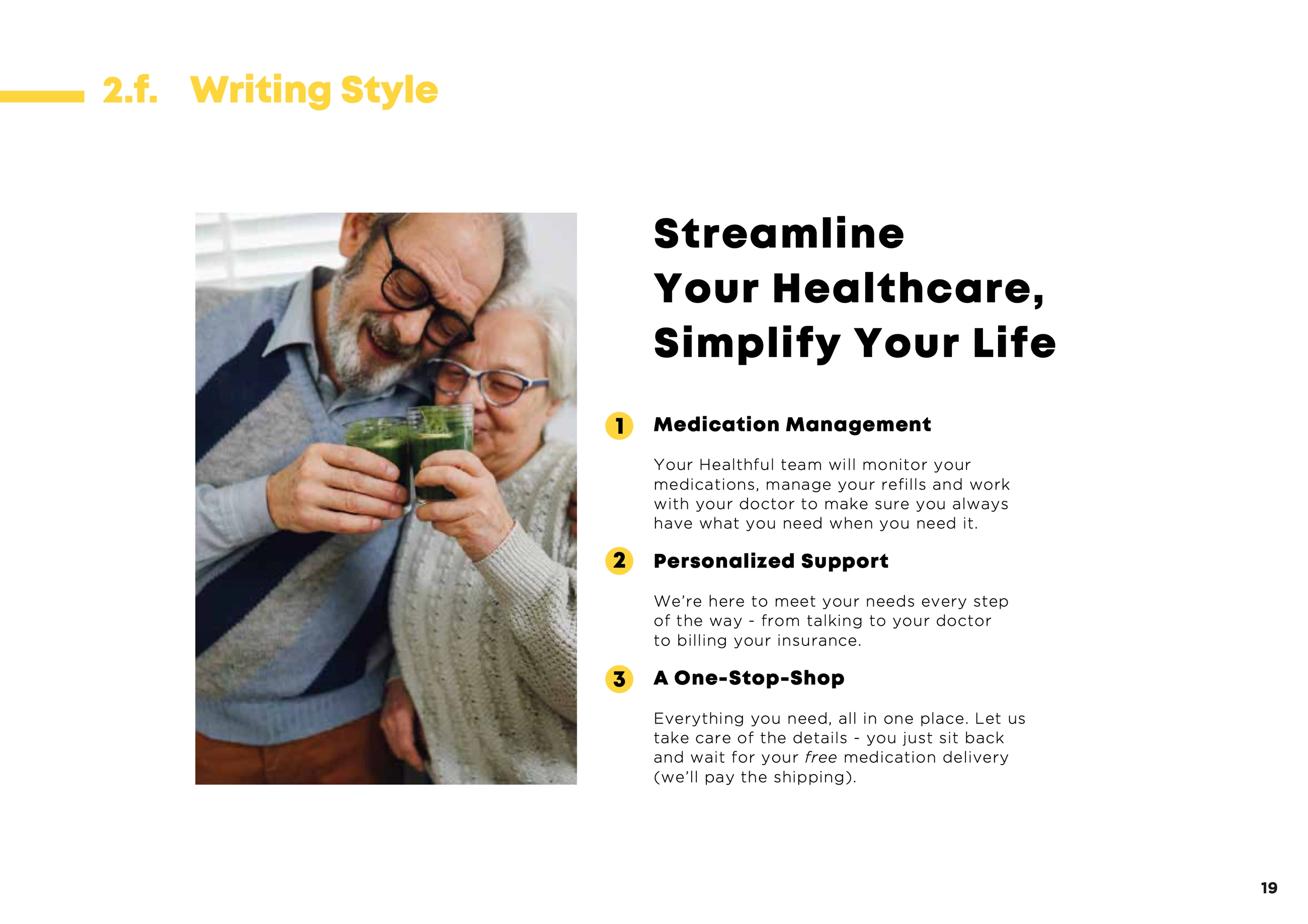
Health and pharmacy copy is its own discipline — legally, not just tonally. I worked with a medical copywriter so everything we shipped was compliant, while I set the voice and messaging system: tone, key messaging, and the language the site was built around.
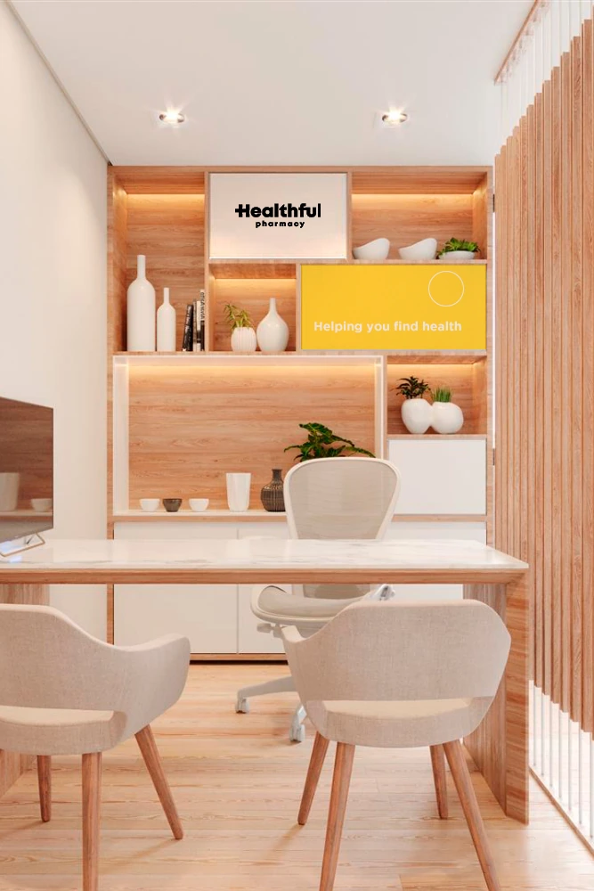
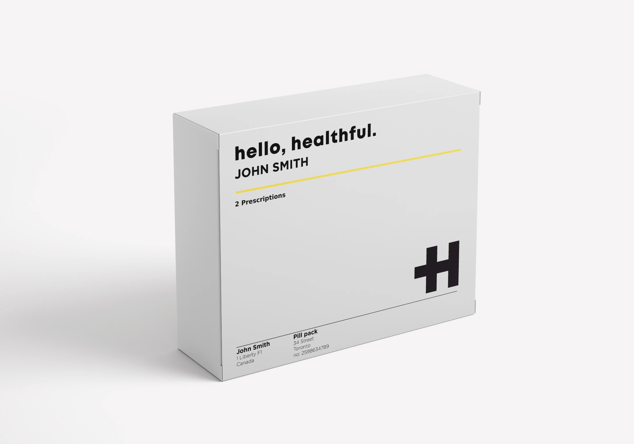
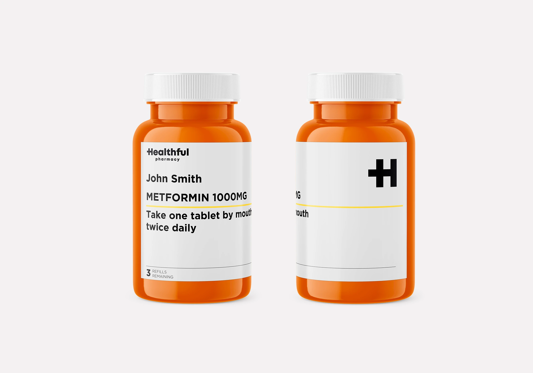
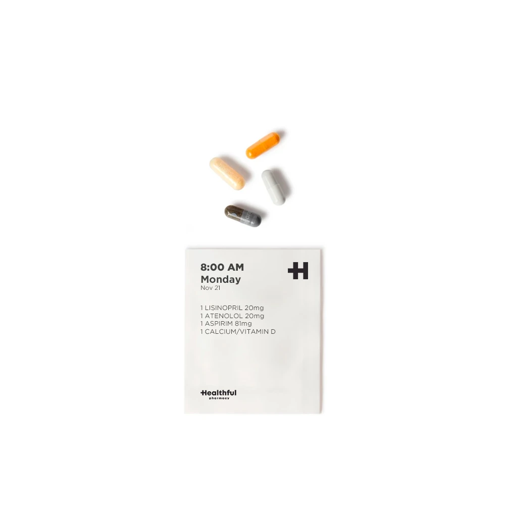
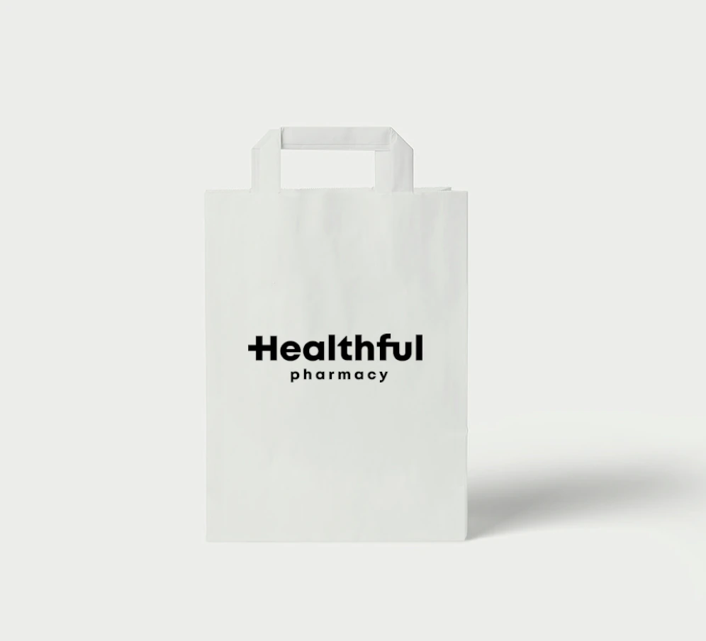
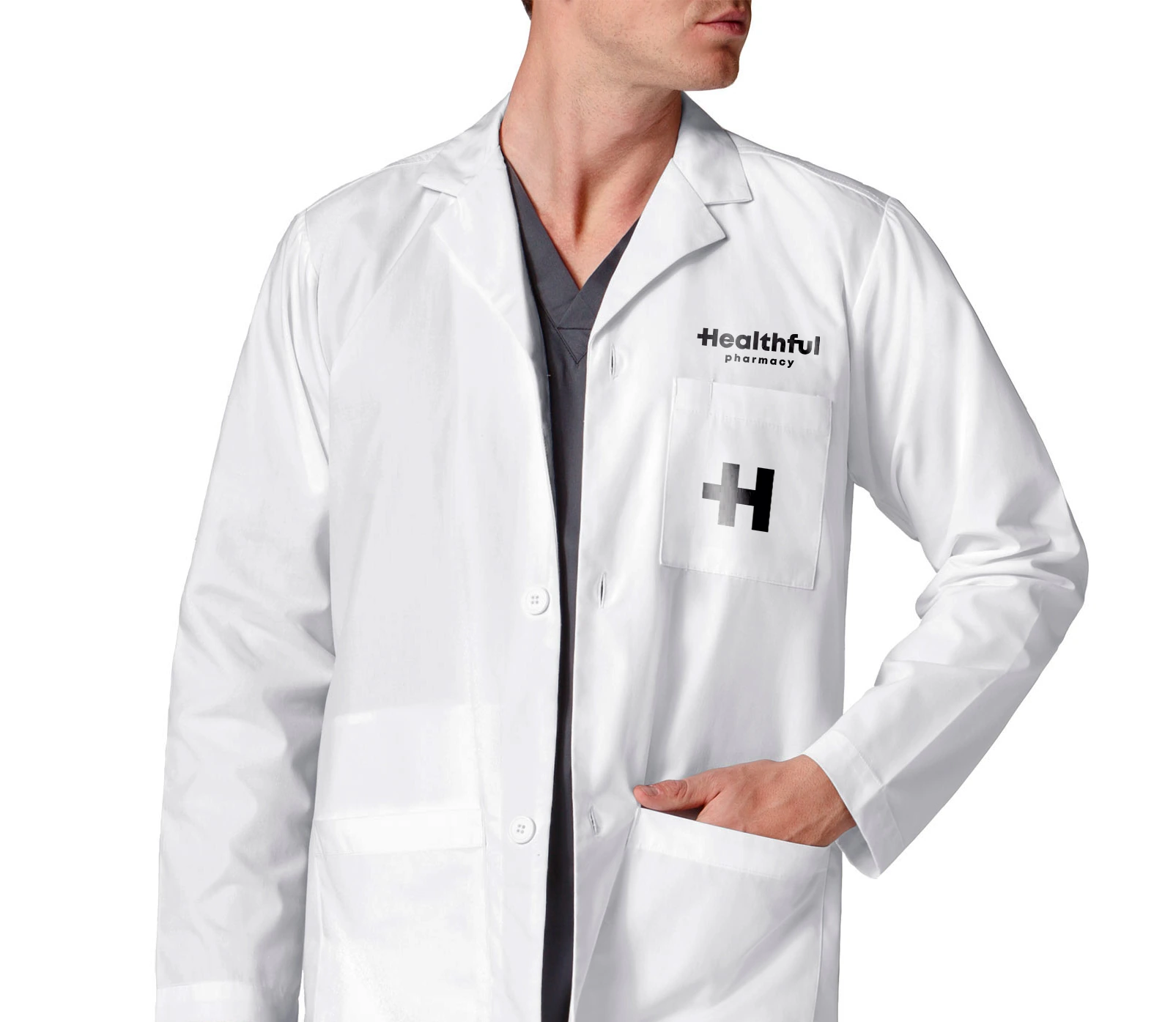
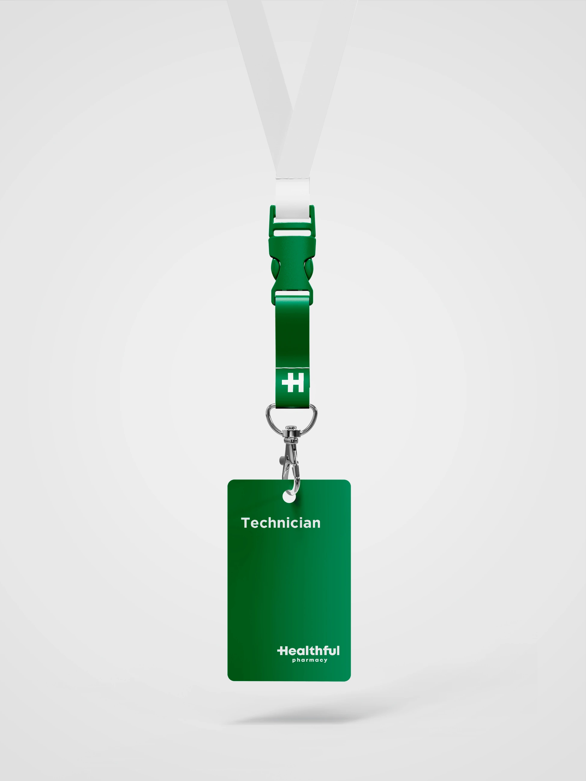
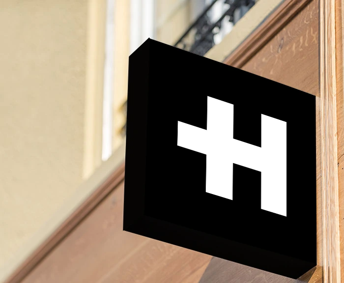
This never actually went into deployed retail — but I was asked to mock up what it would look like in market: flagship store signage, a warm doctor's-office interior, and full product packaging design, from pill bottles to shopping bags to the staff lab coat.