amaran · Aputure
Amaran
Creative Director · Ona Creative · 2024
Amaran makes lighting for creators — powerful gear at a price a person with a bedroom studio can actually reach. The brief was a consumer-facing site that could stand on its own, separate from the parent brand, and speak to Gen Z and Millennial creators in their language. I led the creative: positioning, art direction, copy, and the client relationship, with a UX designer working with me on flows and wireframes. It’s the clearest example of me running a digital build end to end — strategy through to shipped site.
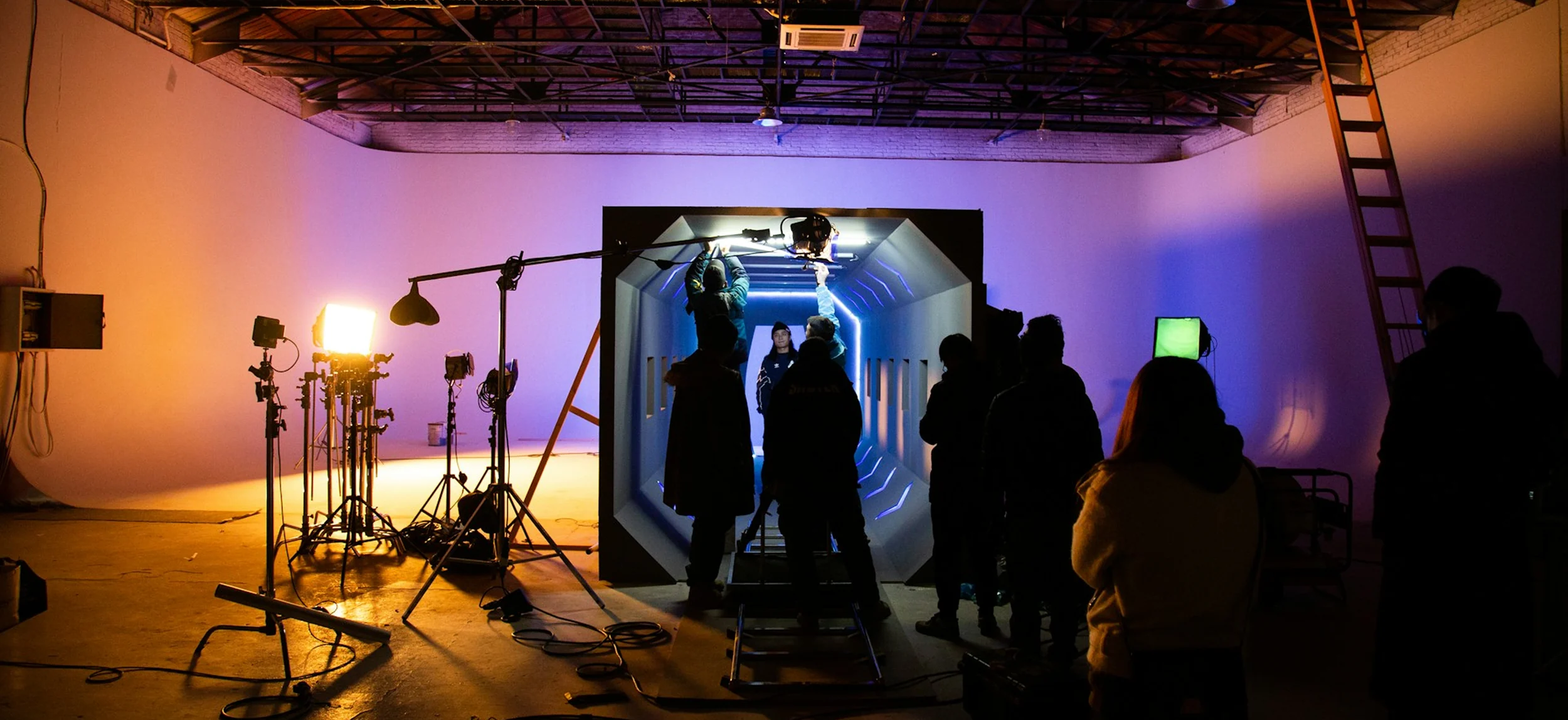
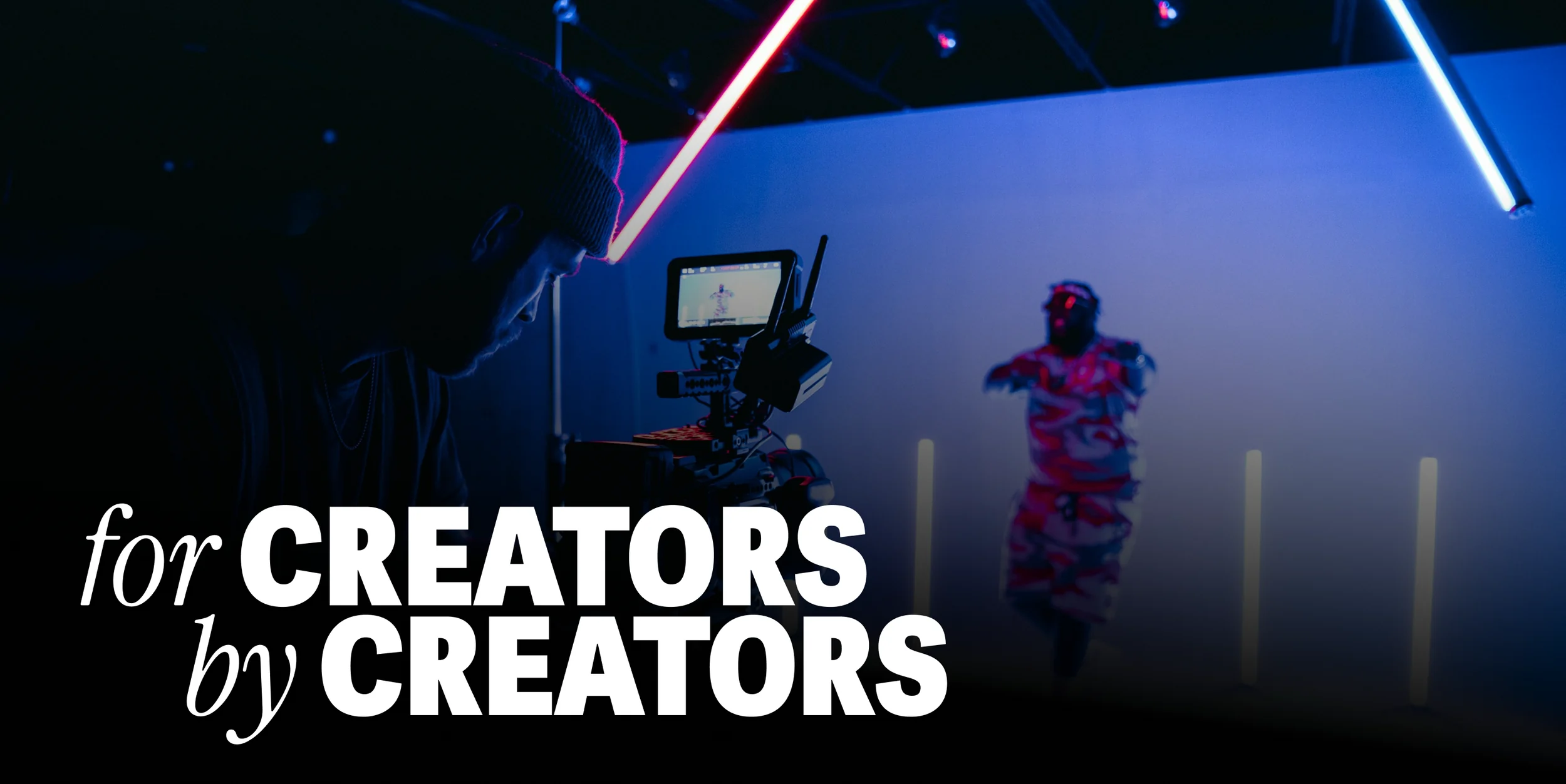
Amaran wasn’t competing on specs — every lighting brand does that. It was competing on who gets to call themselves a creator. We started with user research and a survey of the target audience, and the positioning came straight out of it: not the pro on a soundstage, but everyone building something in a spare room, a garage, a corner of an apartment. Every decision after this — the photography, the copy, the color — traces back to that line.
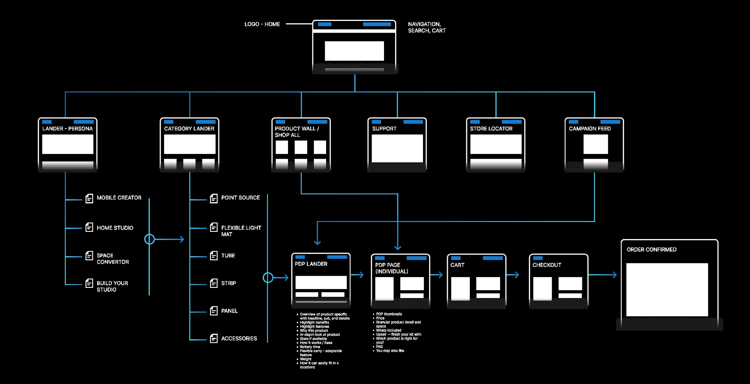
Before a single screen was designed, we mapped how a creator actually shops for light: what they need to understand, in what order, and where they drop off. I directed the flow and the site map with my UX designer — key interactions, decision points, and a content hierarchy built so the answer to “which one do I need?” is never more than a screen away.
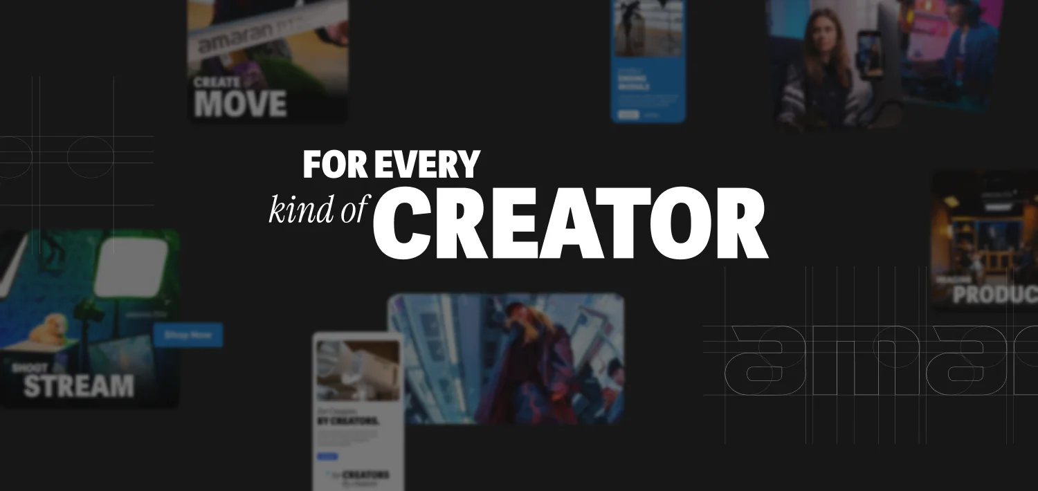
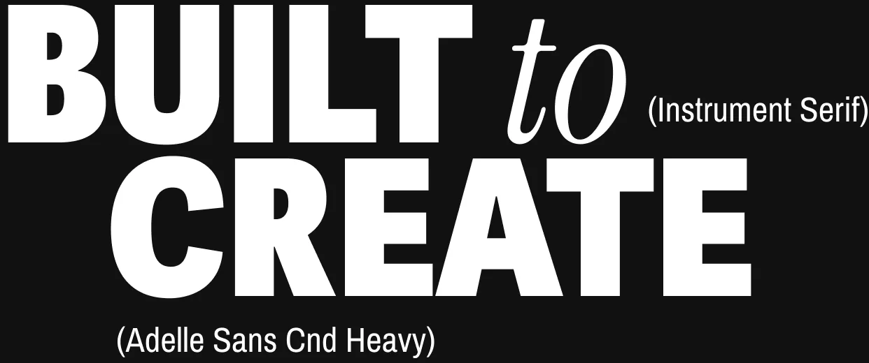
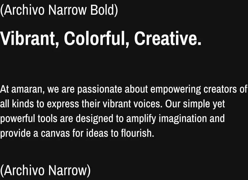
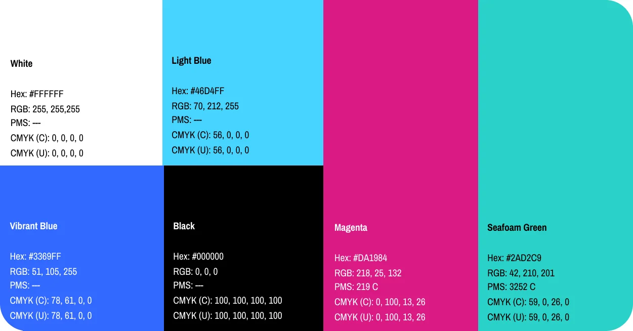
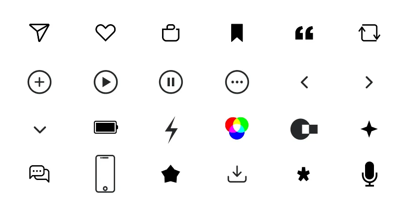
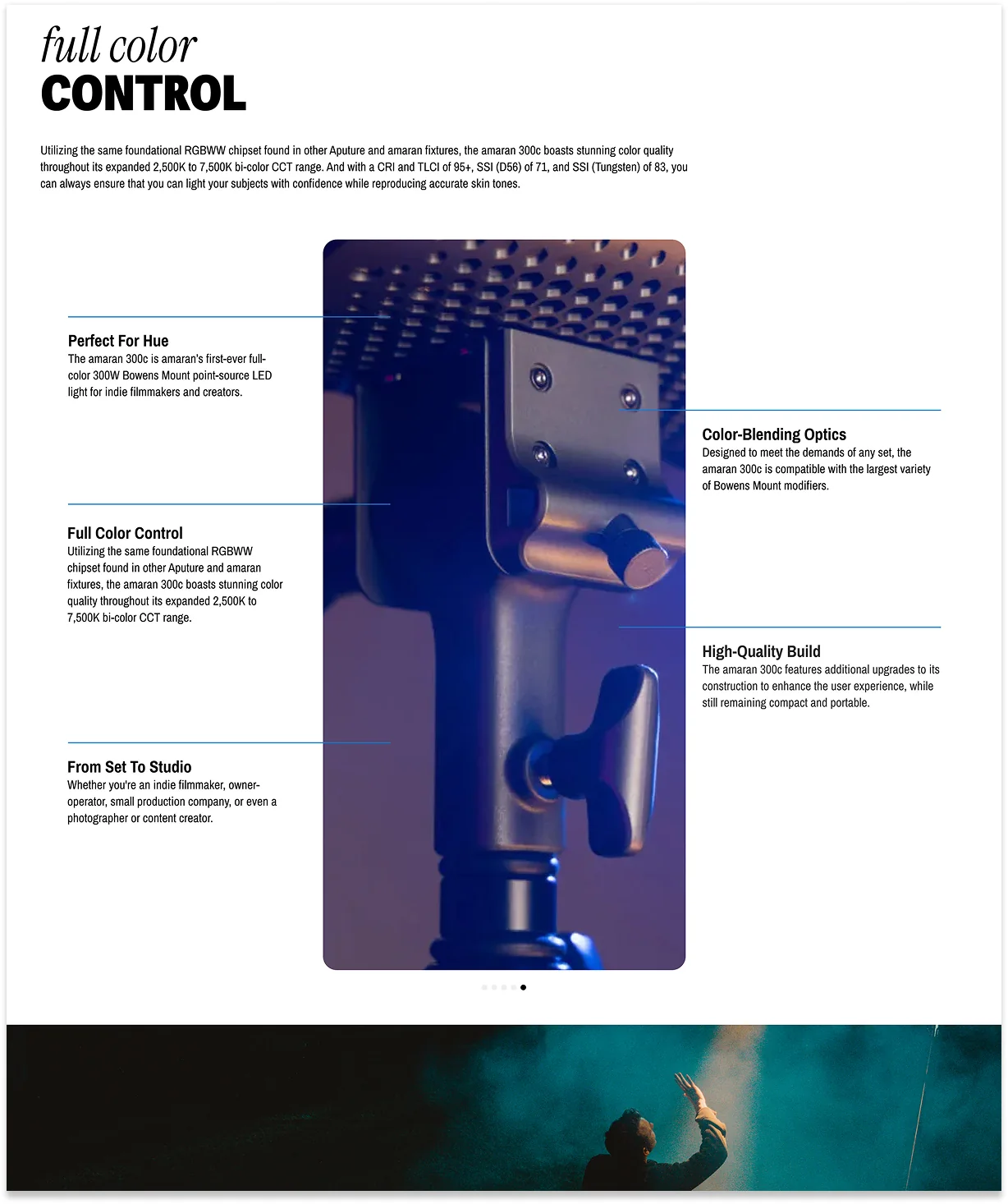
Working from amaran’s existing identity, I built the digital system the whole site runs on — typography, color, buttons, icons, and interactive components, documented as a UI guide so it stays consistent long after handoff. Built to Create became the type lockup: a heavy condensed sans against an italic serif, loud enough for a creator audience without tipping into noise.
I originally took them somewhere else entirely on palette. Internal discrepancies pulled them back to their existing colours and typeface, so I adapted the system to sit correctly alongside the elements they already had — which is its own kind of design problem.
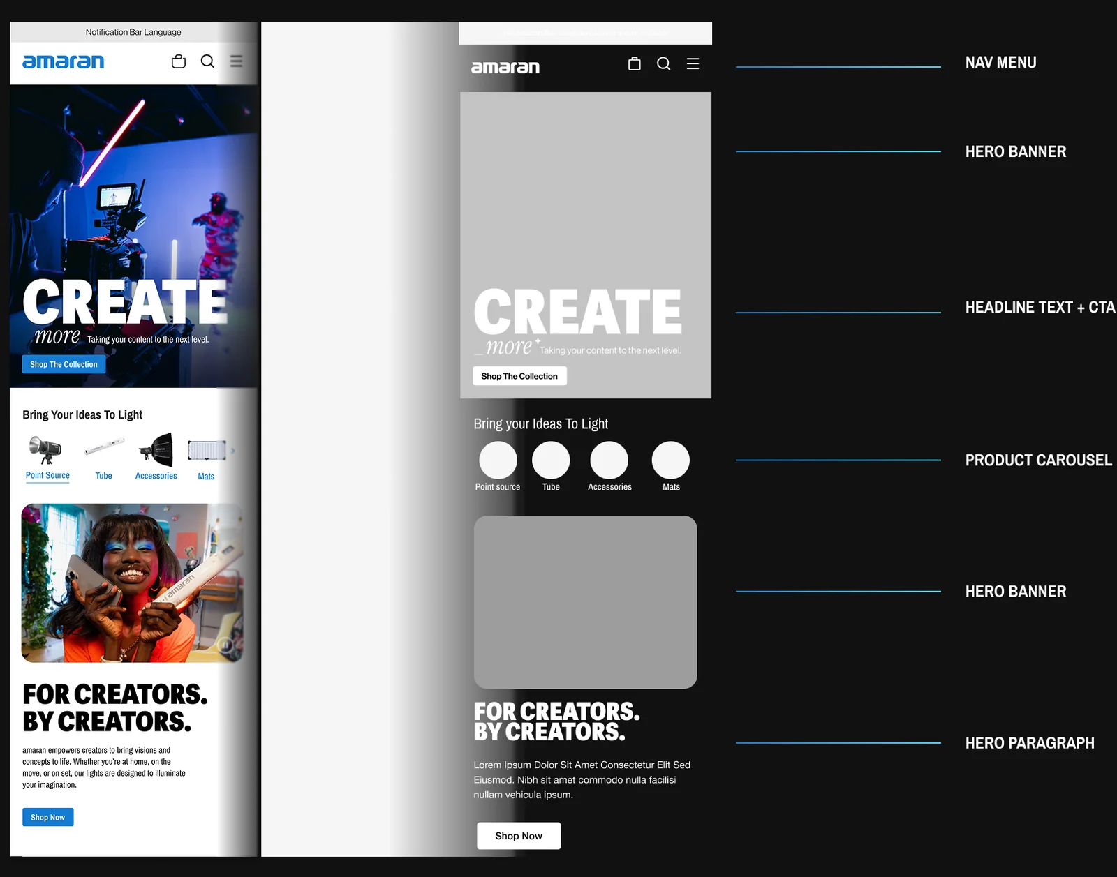
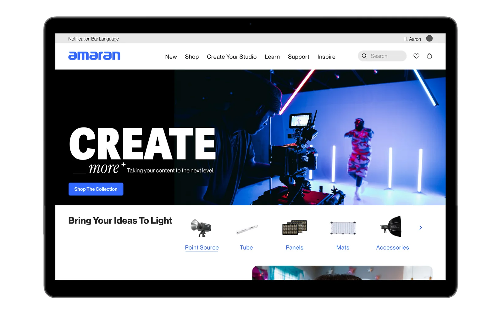
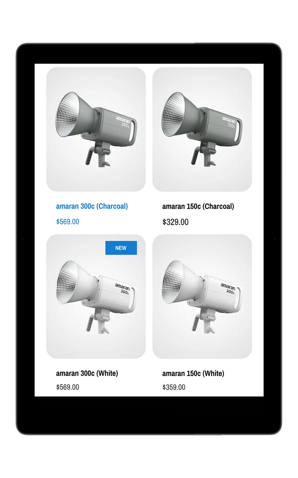
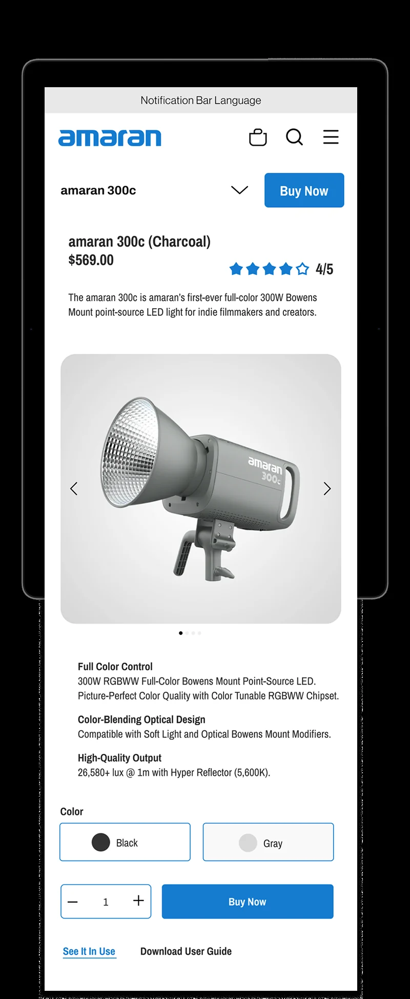
The homepage leads with the brand story of the moment and moves you to the relevant product fast. Category and product pages do the teaching — explaining the innovation, showing the use case, and giving someone enough to actually decide. I wrote the copy across the site and art directed every page, desktop through mobile.
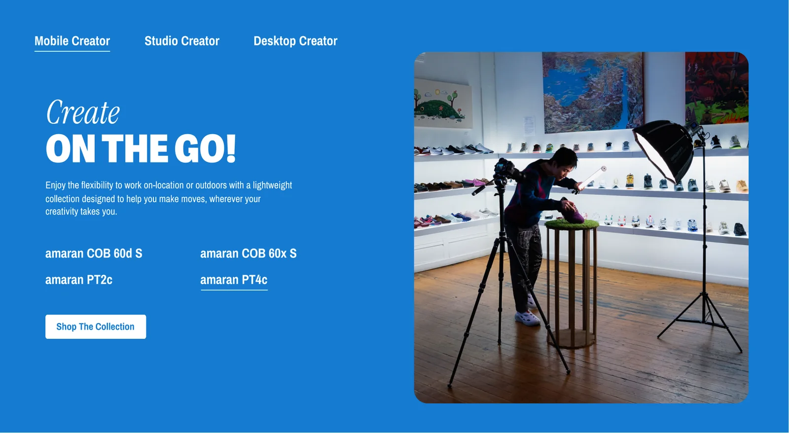
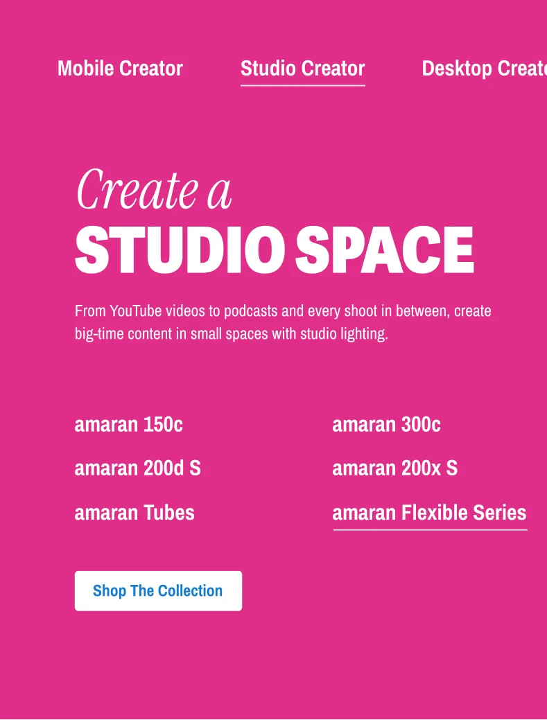
The piece I’m proudest of: an interactive, shoppable tab built around how you create rather than what you buy. Mobile Creator, Studio Creator, Desktop Creator — pick the one that sounds like you and get a curated kit instead of a catalogue. It turns a spec problem into a self-identification one, which is the whole positioning in a single module.
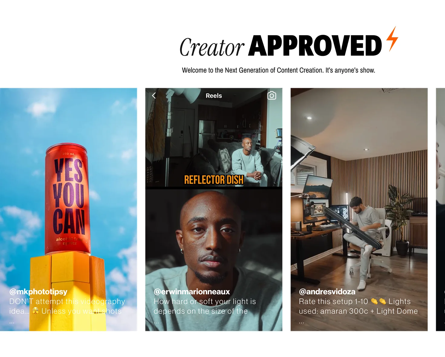
A UGC module pulling real community content into the site — testimonials, reviews, and actual projects shot with the gear. For a brand whose entire argument is “creators like you use this,” the proof had to come from creators, not from us.